Exploring data
Once the data import is completed and at least one dataset is added to the current project’s data section, a final check and a graphical exploration of the data is usually the next step. Clicking on a data set in the data section (left bar) displays a table viewer containing the imported data or the plotting panel in the right part of the screen.
Table Viewer
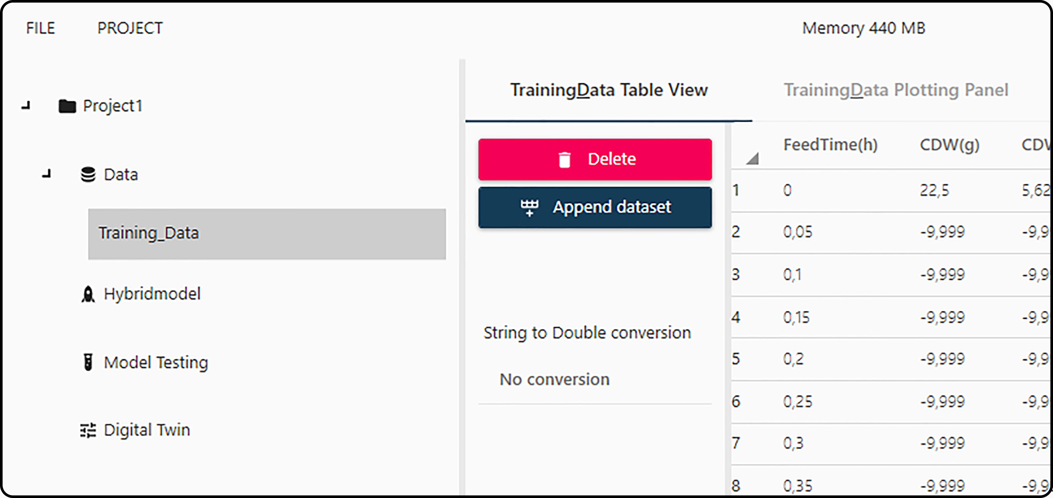
Figure 12. Switch between the data table viewer and the plotting panel.
The main functions of the table viewer are
Viewing and checking the data. Possible import errors are reported in the Import Errors section. The Show indices button at the bottom of the page shows all variables and their position (column number) in the data set.
Note
Data values can no longer be modified at this point.
Delete: using this button deletes the current data set from the project.
Danger
Deleting a dataset is irreversible and might corrupt parts of the project if this dataset has been referenced/used at some point in any other section. It is recommended not to delete datasets unless you are completely sure.
Append dataset: if at least two data sets are available in the data section, they can be combined (row-binded, merged). In a dialog, the target data set has to be selected as well as corresponding/matching columns in the two data sets.
Note
This option is irreversible and only makes sense for data sets with (almost) the same structure (number and nature of columns).
Example:
Suppose you have a dataset
DS1containing observations on 10 experiments/runs and data on 3 new runs have been generated and imported as datasetDS2. Selecting datasetDS2and appending it toDS1gives then a combined data set (namedDS1) with in total 13 experiments.String to double conversion
Plotting panel
Basic plotting
Switching from the table viewer to the plotting panel allows the user to create 2-dimensional plots of the data. In general, three different plot types are available:
Line plot. Plots a 2-dimensional plot, where consecutive \(y\)-values are connected with a line segment.
Scatter plot. Plots a \(x/y\) scatter plot.
1:1 Line. Plots a scatter plot and a 1:1 line (\(y = x\)) such that a correlation between both variables can be better visualized.
If a new figure shall be plotted onto an existing one, Plot on last active figure can be checked (which is the default).
An equivalent concept is the MATLAB hold on function.
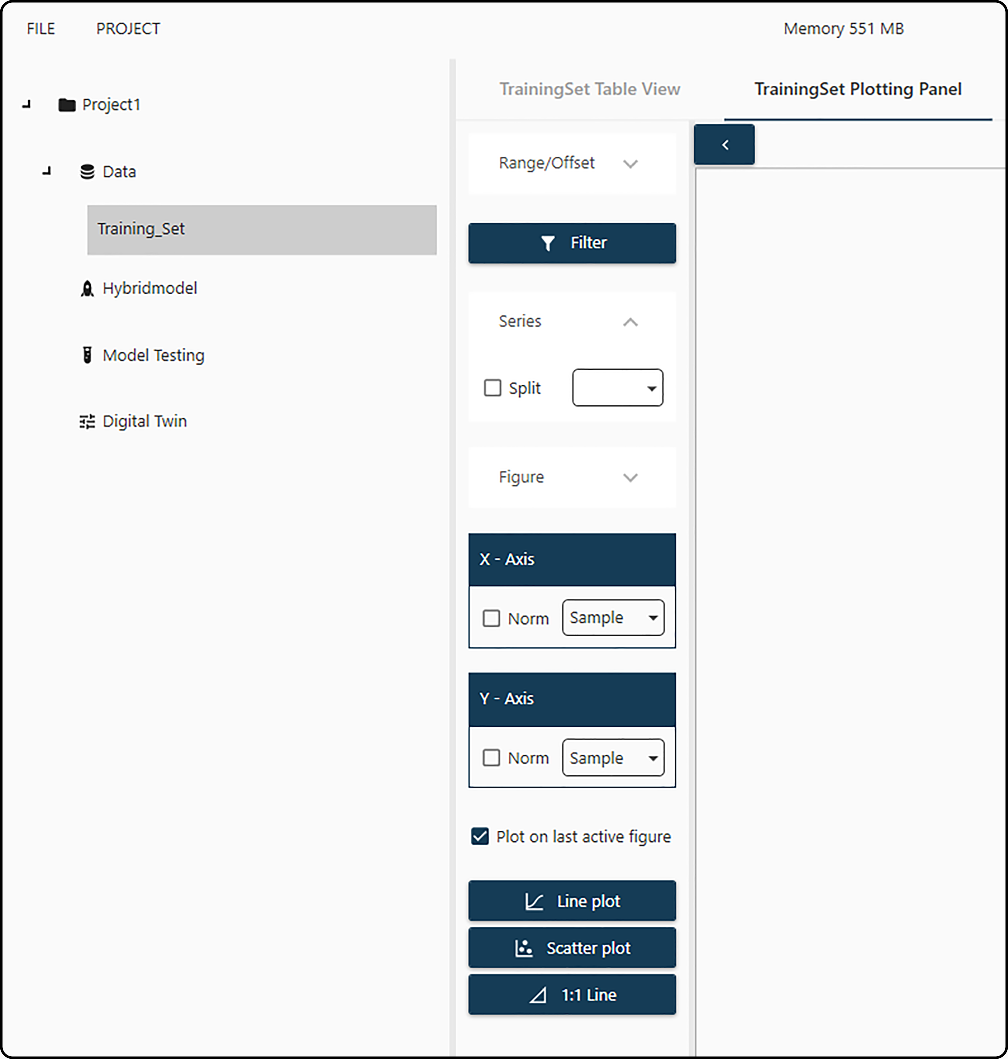
Figure 13. Plotting panel with various options.
Prior to these plots, a few choices should be made:
Range/Offset: allows to select the range of row numbers (i.e. observations) to be plotted (by default all rows are selected). Additionally, an offset can be chosen (default is zero offset).
Figure: expanding this menu allows to specify the figure title, legend and \(x\)- as well as \(y\)-axis labels. In most cases, the defaults will work well.
x-axis and y-axis: variables to be plotted on the horizontal (\(x\)) and vertical (\(y\)) axes, eventually normalized (checkbox).
Filter: Often missing values in the source file are coded by specific (invalid) values, such as -9.999 or -1000. This dialog allows the user to specify this special value and avoid plotting these values by checking both boxes.
Example
Consider the following artificial dataset, in which missing values are coded with the dummy value -9.999.
Table 6. Artificial data set with invalid values¶ Time
VAR_A
Id
0
2
8
1
-9.999
-9.999
2
5
-9.999
3
5.5
-9.999
4
5.75
-9.999
5
5.9
-9.999
0
3
14
1
4.5
-9.999
2
6.2
-9.999
0
2.7
16
1
4.2
-9.999
2
-9.999
-9.999
3
5.98
-9.999
Without further setup, the following output would be the result if the plot type line plot is chosen – the invalid value -9.999 is plotted in the same way as all other values)
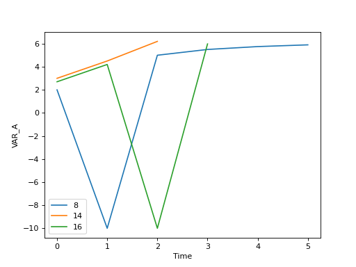
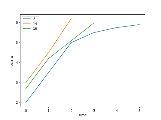
Checking both boxes in the Filter menu and setting -9.999 as the specific value gives the correct result by filtering/ignoring these dummy values.
Series: Often data sets will consist of observations of multiple runs/experiments/time series. To guarantee a proper plotting in this case, the Toolbox needs a variable to discriminate between series, so typically a time-variable has to be specified here and the box must be checked.
Example
Consider the following artificial dataset
Table 7. CoolDataset¶ Time
VAR_A
Id
0
2
8
1
3.2
2
5
3
5.5
4
5.75
5
5.9
0
3
14
1
4.5
2
6.2
0
2.7
16
1
4.2
2
5.6
3
5.98
Selecting
Timeasx-variable (horizontal) andVar_Aasy-variable (vertical, response) in a Line plot without further setup,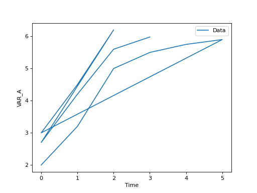
would ignore the fact that the data originate from 3 different runs. Selecting
Timeas Split variable will detect each new series due to the fact that in row 7 of the data time is smaller than in row 6 (and the same for rows 9 and 10). Furthermore, the labels are correctly handled in the legend.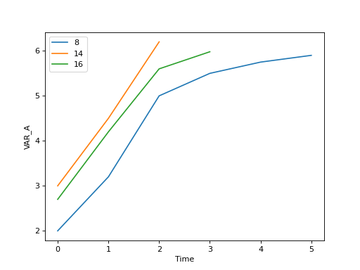
Further Options
Once a (line- or scatter-) plot is created, it appears in the plotting panel on the right side and as a Figure tab in the main bar. Pressing the left mouse button in the figure region shows \(x\)- and \(y\)- values of the nearest point, moving the mouse while holding down the right mouse button shifts the figure horizontally and vertically and scrolling allows to zoom in and out.
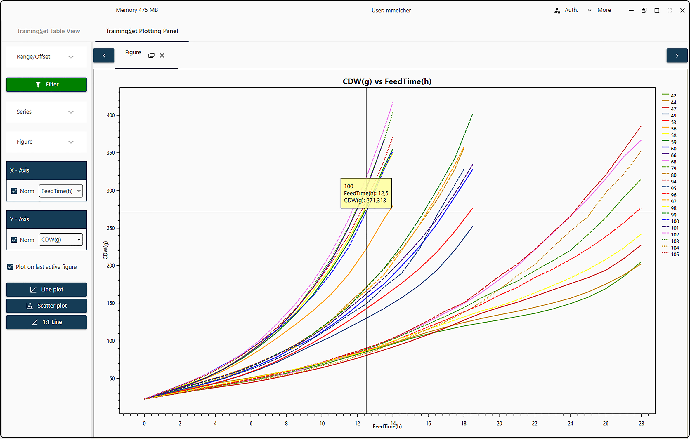
Figure 14. Plotting panel with interactive options.
Further options become available when undocking the figure from the main bar
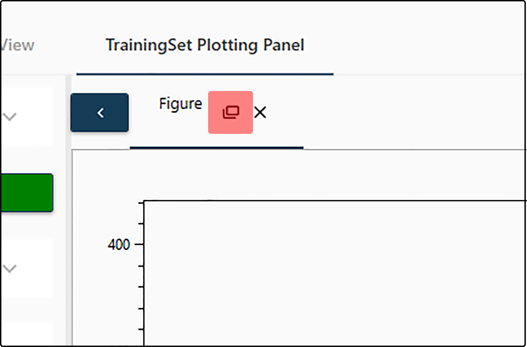
Figure 15. Undocking a figure.
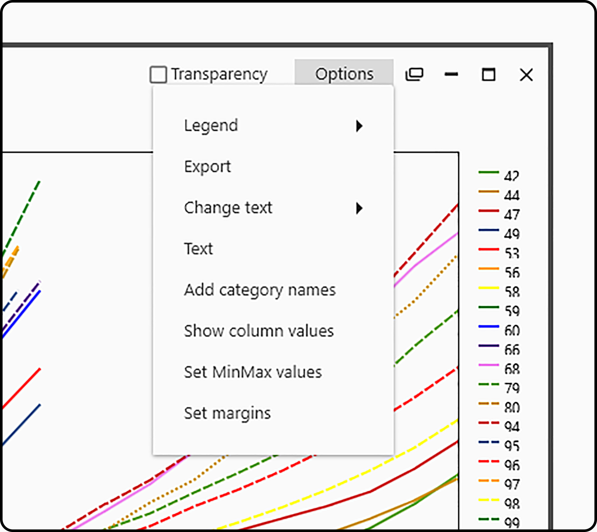
Figure 16. Advanced plotting options.
Legend: allows to turn on/off the figure legend, select its placement (inside or outside the figure region), its orientation (horizontally or vertically) as well as its position (top or bottom, left/center/right) in the figure.
Export: export the current figure as .pdf (portable document format), .png (portable network graphics) or .svg (scalable vector graphics). Furthermore, its size in pixels can be specified.
Change text: change the text of the legend (often run/experiment IDs), the main title and the axes (\(x\) and \(y\)) labels.
Text:
Add category names:
Add column values:
Set MinMax values:
Set Margins: allows to change many aspects of the figure, such as figure margins or grid lines. Note that changes become visible after pressing the corresponding Apply button.
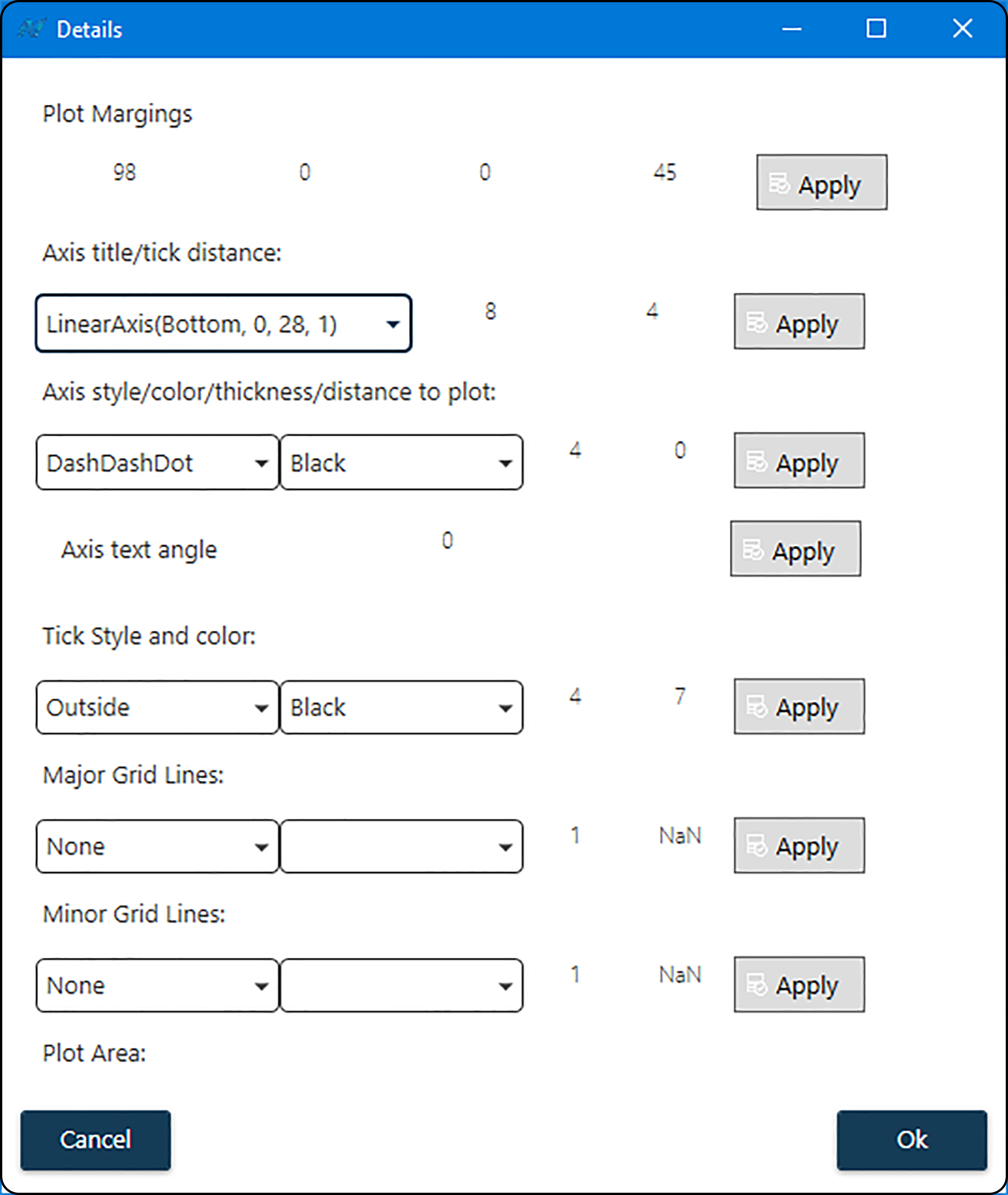
Figure 17. Fine control of the plot appearance in the Set Margins menu item.
Plot margins: amount of whitespace to the left (first value), on top (second value), to the right (third value) and at the bottom (last value) of the figure.
Axis title/tick distance: distance between axis and label (first value) and between axis and annotation (second value).
Note
Any changes made here or at a one of the following items apply only to the axis – bottom (\(x\)) or left (\(y\)) – selected in this drop-down menu.
Axis style/color/thickness/distance to plot: style (solid, dashed, …), color, thickness of axis and its distance to the figure region.
Axis text angle: rotation (in degrees, clockwise) of the axis annotation.
Tick style and color: position, color and size of the axis ticks (first value: minor tick, second value: major tick size).
Major grid lines: style, color, thickness and spacing of major grid lines.
Minor grid lines: style, color, thickness and spacing of minor grid lines.
Plot area: