Plotting panel
In the plotting panel model results can be visualized in order to get an impression of their performance. It is possible to plot individual models as well as averaged/combined models.
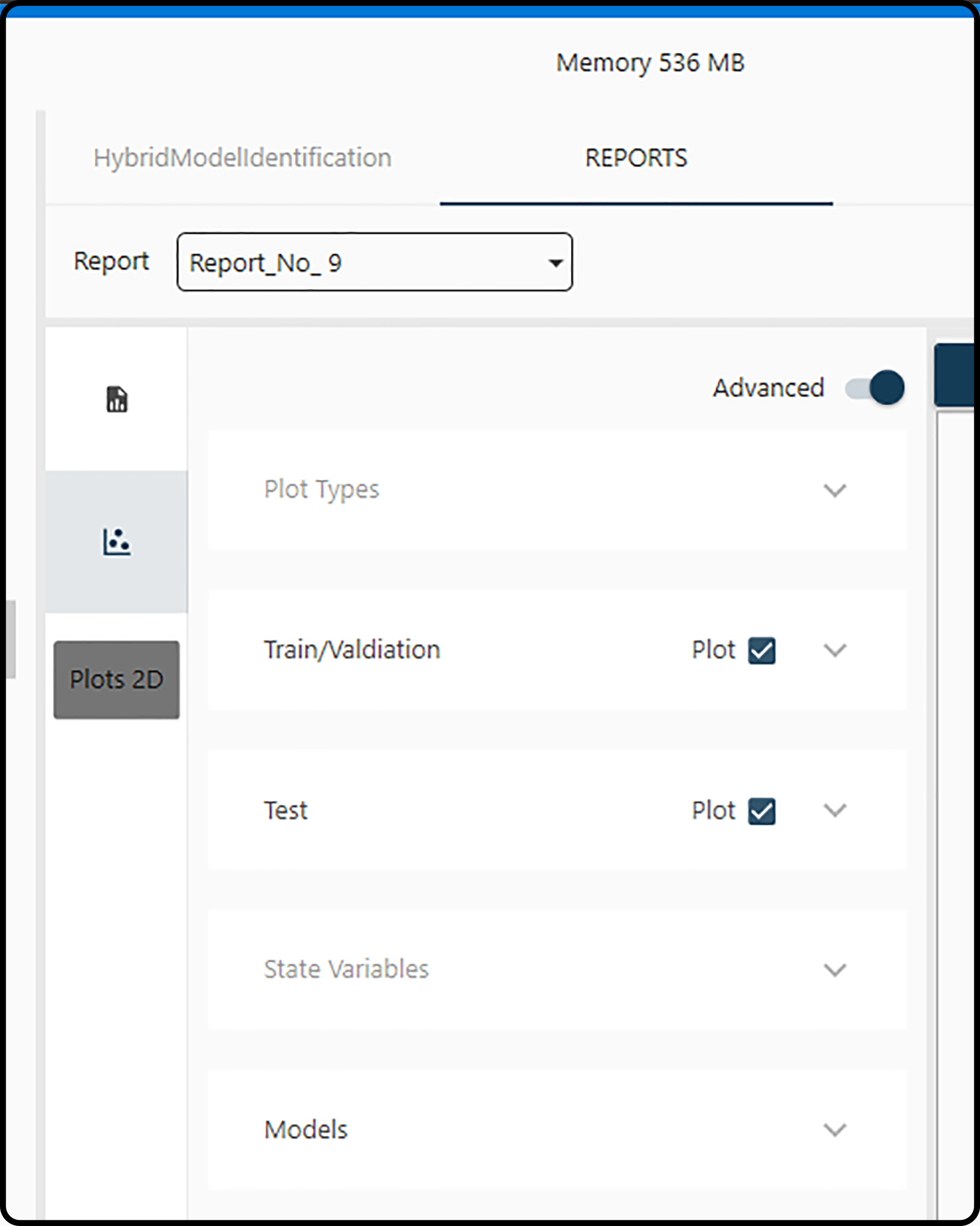
Figure 29. Plotting options.
Generating plots of models requires that a report has been created and a few decisions on
Report: selection of the report containing the model(s) to be visualized
Plot Type: plotting of model predictions versus the true values or the model predictions versus time; furthermore, the error measure and model sorting type have to be selected.
Train/Validation data set: plot the results for the training and validation set or of certain subsets (runs/experiments)
Test data set: plot the results for the test set or of certain subsets (runs/experiments)
State Variables: one or more of the output variables may be selected.
Models: which models shall be plotted.
Report selection
At first, the desired report has to be selected containing the model(s) to be explored in the report drop-down menu.
Plot type
In the first two options (both are selected by default) the general plot type(s) is/are determined.
Plot target vs. model
If set to True, the true (actually measured) values are plotted versus the model predictions in a scatter plot. If most points in this scatter plot are near the
1:1 line, a good agreement of the predicted and measured values and hence an adequate model is indicated.
Time series plot
In a target vs. model (time) plot the model predictions as well as the true values are both plotted versus time. A model can be classified as adequate, if both curves are close to each other in this plot.
Errors
In the last 3 Plot Type options information on model errors can be controlled.
Plot error info
If set to True (which is the default), an error bar is included for each subplot (i.e. for each run/experiment) containing both partial errors (errors for each
plotted subset) and the total error (average error of all subsets). All errors displayed on plots are calculated according to the subsequent
error type.
Error Types
In the formulas below, \(n\) means the number of observations, \(y_i\) the actual (measured) values, \(\hat{y}_i\) the model predictions, \(\overline{y}\) the mean output value and \(y_\text{min}\) and \(y_\text{max}\) the minimum and maximum output value.
Tag |
Method |
Formula |
|---|---|---|
ME |
Mean Error |
\[\frac{\sum_{i=1}^n (y_i-\hat{y}_i)}{n}\]
|
MAE |
Mean Absolute Error |
\[\frac{\sum_{i=1}^n\left| y_i-\hat{y}_i\right|}{n}\]
|
MPE |
Mean Percentage Error |
\[\frac{100\%}{n}\sum_{i=1}^n \frac{y_i-\hat{y}_i}{y_i}\]
|
MAPE |
Mean Absolute Percentage Error |
\[\frac{100\%}{n}\sum_{i=1}^n \left|\frac{y_i-\hat{y}_i}{y_i} \right|\]
|
MSE |
Mean Square Error |
\[\frac{1}{n}\sum_{i=1}^n(y_i-\hat{y}_i)^2\]
|
RMSE |
Root Mean Square Error |
\[\sqrt{\frac{\sum_{i=1}^n (y_i - \hat{y}_i)^2}{n}}\]
|
NRMSE |
Normalized Root Mean Square Error |
\[\begin{split}\begin{matrix}
\text{if mean} \neq 0, & \frac{\text{RMSE}}{\bar y} \\
& \\
\text{if mean} = 0, & \frac{\text{RMSE}}{ y_\text{max} - y_\text{min}}
\end{matrix}\end{split}\]
|
RMSPE |
Root Mean Square Percentage Error |
\[\sqrt{\frac{\sum_{i=1}^n (\frac{y_i - \hat{y}_i}{y_i})^2}{n}}\]
|
MASE |
Mean Absolute Scaled Error (Non seasonal time series) |
\[\frac{\frac{1}{J}\sum_{j}\left| Y_{j}-F_{j} \right|}{\frac{1}{T-1}\sum_{t=2}^T \left| Y_t-Y_{t-1}\right|}\]
|
\(\text{R}^{2}\) |
Coefficient of determination |
square of the correlation coefficient \(r^2(y,\hat{y})\) |
Sorting
The generated plots (each corresponding to a certain model) can be sorted by
Default: no sorting.
Plots Global: sorted by the current selected error type.
Training: sorted by the calculated training error during report creation.
Validation: sorted by the calculated validation error during report creation.
Train/Valid: sorted by the calculated average training and validation error during report creation.
Training/Validation and test set
Checking the corresponding box(es), a scatter and/or time series plot is/are included (see Plot Types) for the training/validation and/or test data set. For each of these datasets, specific subsets (corresponding to runs/experiments) can be selected/unselected for plotting by expanding this item.
Hint
The plotting colors for subsets can be modified by clicking the color box and picking a suitable color.
Output variables
As many variables as output variables defined during the model identification step are listed here in rows. For each output variable, plotting of the model, of the (observed/measured) target and of prediction intervals (PIs) can be selected (the default) or deselected. Note that this selection only has an effect on time series plots and prediction intervals can only be obtained for averaged models. Each output variable being plotted will be displayed in a new subplot row.
Models
In this item all models available in the current report are listed. At least one model must be selected.
Note
Checking or unchecking the dotted box on top will select of deselect all available models.
Note
Both the boot and random start number are indicated between parenthesis.
Button actions
Note
plot(s) will be generated, if at least,
one state variable applies,
one plot type (scatter or time series) applies,
one model is selected and
one dataset is selected, with at least one subset also being selected.

Figure 30. Plotting buttons for plotting single or averaged models.
Plot
Generates an individual plot for each selected model with one row for each selected output variable.
Plot avg.
Generates a single plot averaging all selected models.
Note
Consider enabling the plot prediction interval (PI) plotting option.
Note
If only one model is selected, the resulting plot will be the same as just clicking Plot.
Close all
Closes all active plots.
Delete sel.
Deletes selected models from the report.
Finally, after several selections successfully performed, the plot(s) will appear on the right part of the plotting panel. Each plot appears in a separate tab on top of the plotting panel. The Export options allows to export both the plots as well as the data, on which they are based, to Microsoft Excel.
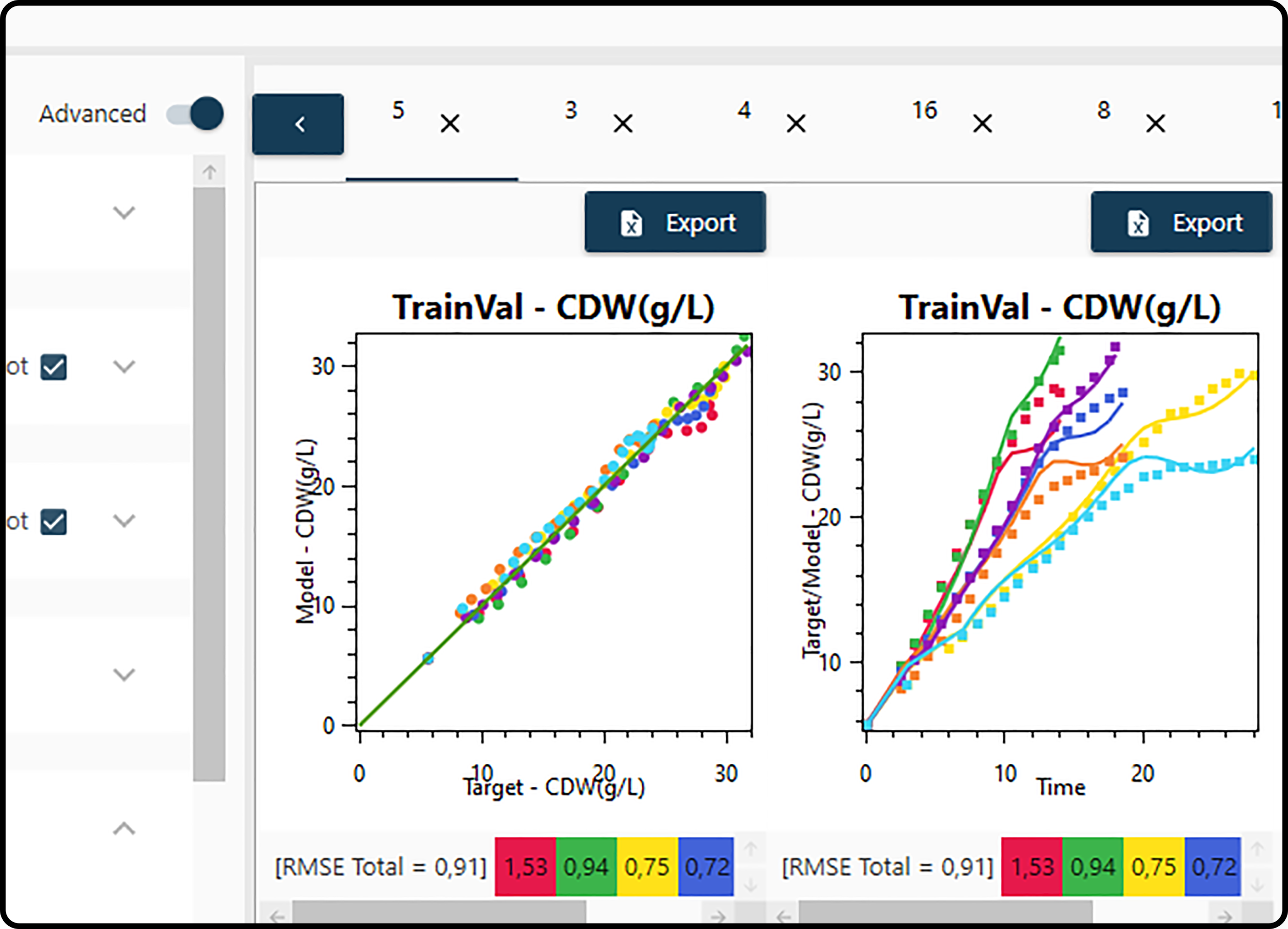
Figure 31. Several created plots appear as tabs in the plotting panel with the possibility to export them to Microsoft Excel.